Commerce Kit 目前处于测试版阶段。API 可能会在正式版发布前发生变化。有关 Commerce Kit 的更多详细信息,请参阅 Commerce Kit 文档。
来自 Commerce Kit 的
PaymentButton
组件,提供了完整的支付界面——开箱即用地处理钱包连接、代币选择、交易处理和 UI 状态。
安装
pnpm add @solana-commerce/kit
基本用法
import { PaymentButton } from "@solana-commerce/kit";function Checkout() {return (<PaymentButtonconfig={{merchant: { name: "My Store", wallet: "your-wallet-address" },mode: "tip"}}onPaymentSuccess={(signature) => {console.log("Payment confirmed:", signature);}}/>);}
欢迎访问 Commerce Kit Playground 配置和测试该组件。
打赏按钮
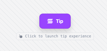 打赏按钮
打赏按钮
支付弹窗
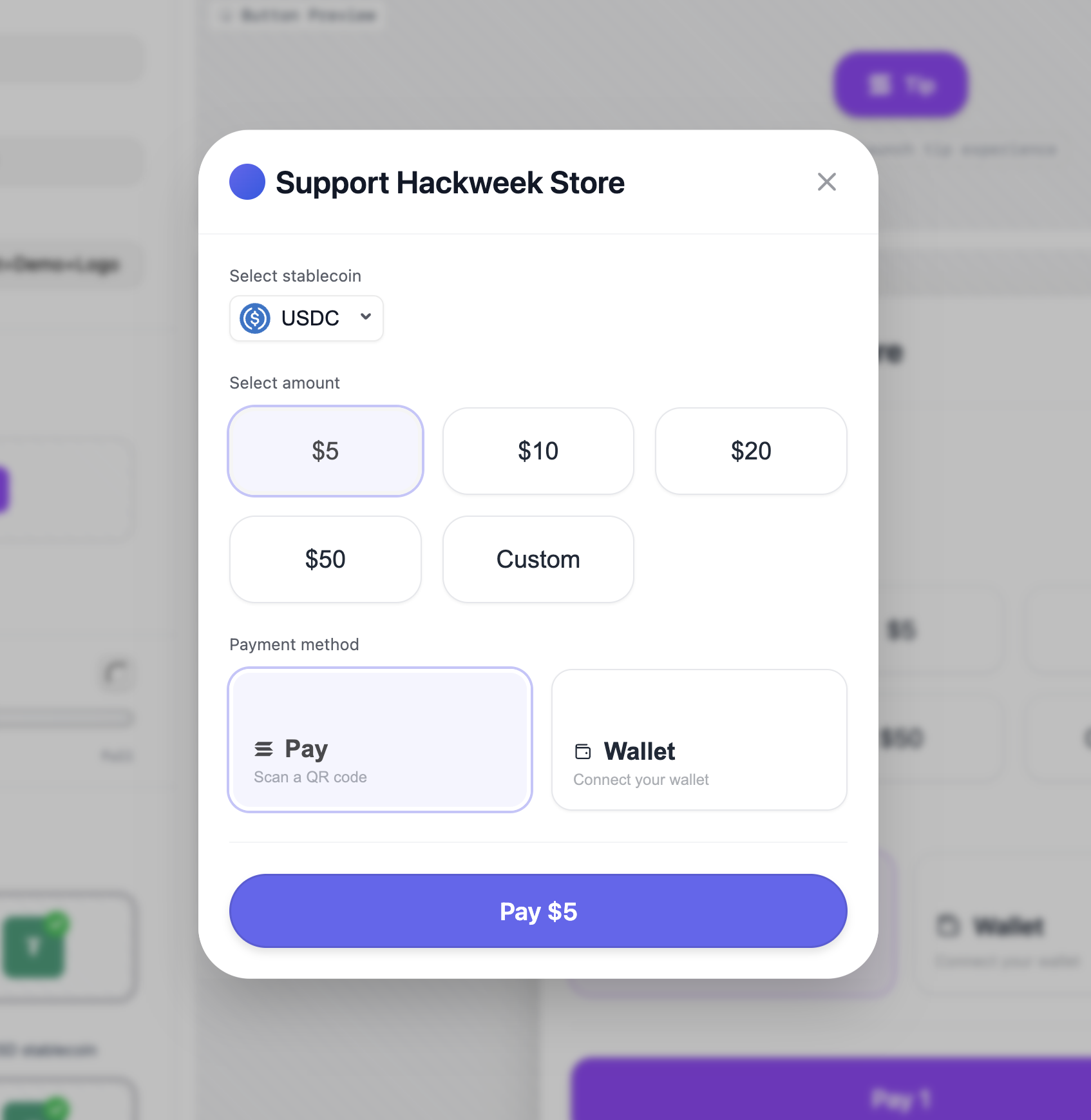 支付弹窗
支付弹窗
Solana Pay 二维码弹窗
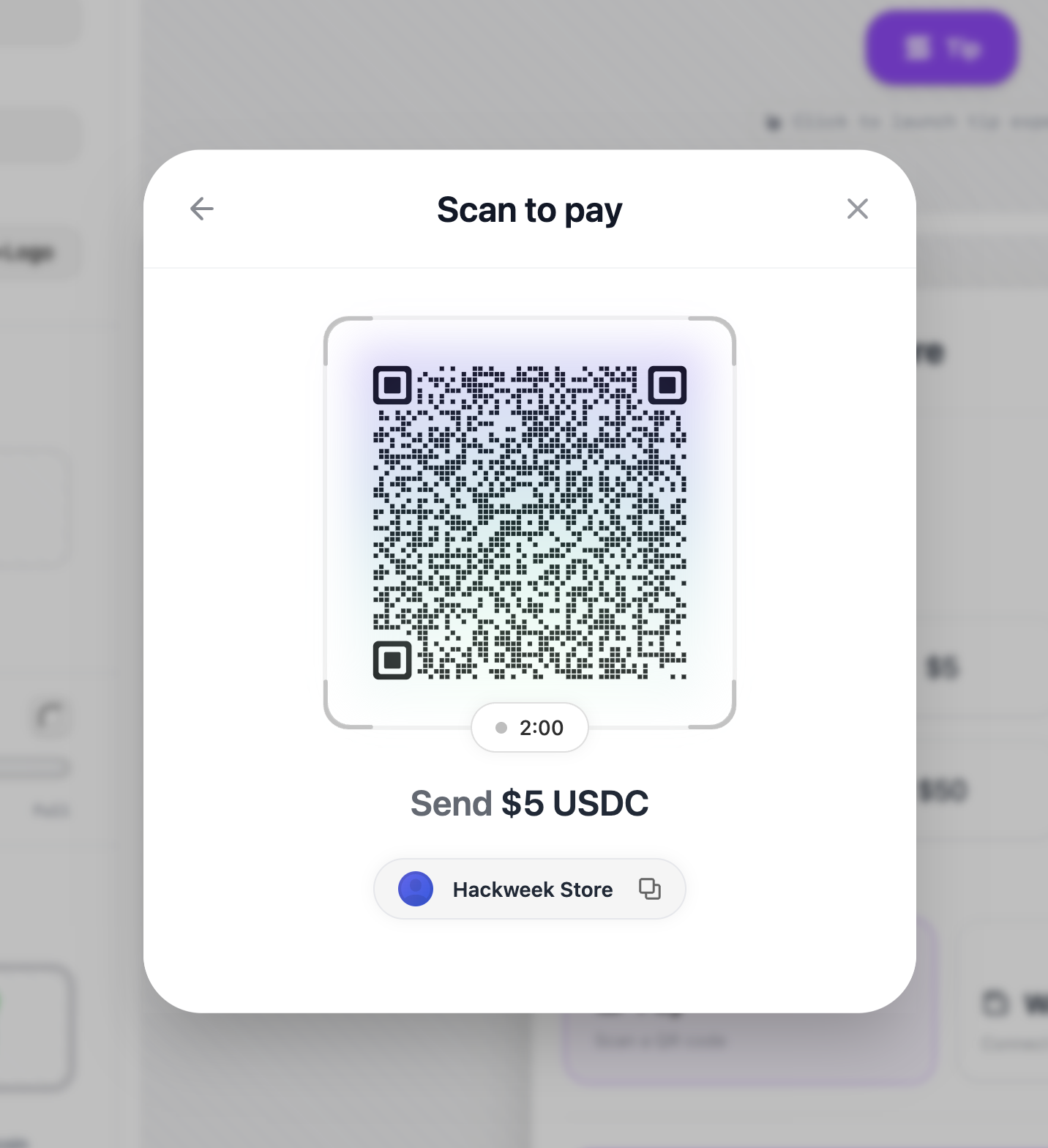 Solana Pay 二维码弹窗
支付模式
mode 选项决定按钮的行为:
| 模式 | 描述 |
|---|---|
tip | 用户自定义金额(捐赠/打赏) |
配置
必填配置
| 属性 | 类型 | 描述 |
|---|---|---|
merchant.name | string | 结账时显示的商家名称 |
merchant.wallet | string | 用于收款的 Solana 钱包地址 |
mode | 'tip'` | 支付流程类型 |
可选配置
| 属性 | 类型 | 描述 |
|---|---|---|
network | 'mainnet' | 'devnet' | Solana 网络(默认值:'mainnet') |
rpcUrl | string | 自定义 RPC 节点 |
allowedMints | string[] | 通过 mint 地址限制可接受的代币 |
showQR | boolean | 启用二维码支付选项 |
theme | ThemeConfig | 外观自定义(颜色、圆角等) |
事件回调
| 回调 | 参数 | 描述 |
|---|---|---|
onPaymentSuccess | (signature: string) | 交易已在链上确认 |
onPaymentError | (error: Error) | 支付在任何阶段失败 |
onPaymentStart | () | 支付流程已启动 |
onCancel | () | 用户取消了支付 |
自定义触发器
用你自己的元素替换默认按钮:
<PaymentButtonconfig={{merchant: { name: "Shop", wallet: "address" },mode: "tip"}}><button className="my-custom-button">Pay with Solana</button></PaymentButton>
Is this page helpful?